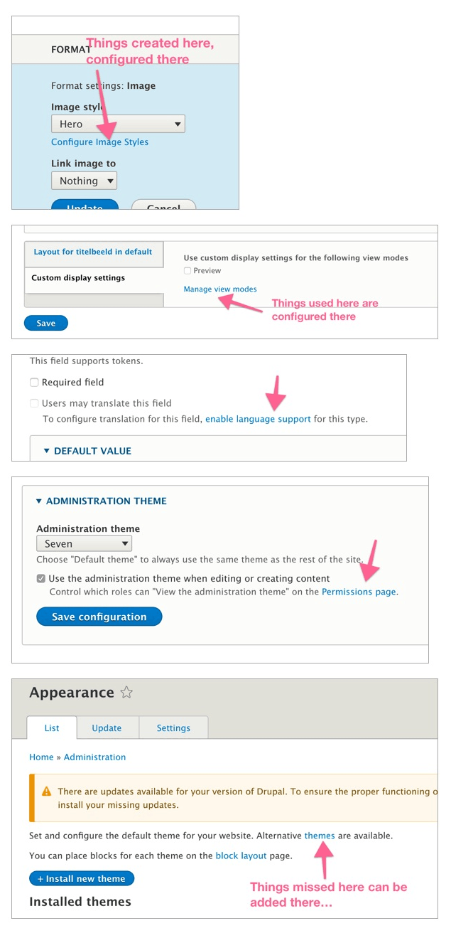
Things seen here are configured there.

An elaboration on underlying considerations that make simple suggestions as this one not so simple after all.
An important consideration when deciding whether to “add something to core” is that generally speaking, core doesn’t do one-offs. The underlying principle is not “make it do X” but “make it possible to make it do X (and X2, X3,…)
Linking from a create context to a configuration context
In this particular case we have a proposal to link to the screen where you can add new content types from the page that lists available content types to create content with. Or, in url speak: on /node/add, put a link to /admin/structure/types. Or once more: on the screen that lists existing content types that you can create content with, add a link to the screen that lets you define new content types.
Notice the distinction between “create content of type X” and “define a new type of content Y”. The first is a content creation task, the second is a content definition task (in Drupal jargon usually captured under “site building”). This distinction then should clarify why a link to define a new content type should not use the “blue + button” pattern on a screen that is in service of a content creation task.
Back to the “no one-offs” principle. Where and how can we add a link of this kind? To answer that question we should look for possible patterns. Is there a more generalised definition for the type of problem that this single link to elsewhere wants to solve?
The example is: put a link to the content type definition area on the screen that lists already available types to create content with. Restated more generally: link to that area of the Drupal admin where the things on this screen are configured.
Connecting the dots is important
You know those links at the bottom of product pages in an online store: “people who bought this item also bought X, Y and Z”. In our case it’s more like “Things seen here are configured there.
I noticed a sort of similar pattern in the Android OS settings pages, where the screen ends with suggestions of related topics to the ones already shown. It’s a way to provide meaningful next places to go if the current page didn’t offer what you were looking for (and is of course a symptom of how many settings there are in the first place).
“Things seen here are defined there.
If we can find more examples of where this would be meaningful and helpful then we might have a good case for introducing a new user interface pattern. See image for some initial examples.