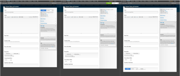
Drupal 8 has a redesigned content creation page. This is how it came to be.

We want to be faster and bolder in shipping design improvements for Drupal 8. But how? Lets have a look at a relatively big (but not super huge) design change built for Drupal 8 during the development cycle and see what we might learn from it.
Redesigning the content creation page
Drupal 8 ships with a significant overhaul of the content creation page (“node form” for intimi). It’s design process and subsequent implementation are extensively documented on drupal.org. This is a high level summary of how this redesign come to be.
Steps in the process:
- Research
- Sketch
- Design
- Test
- Implement
Who were working on this? In the earliest design stages primarily 3 people: Bojhan Somers, Jared Ponchot and moi, Roy Scholten. Many more helped with finetuning design elements, usability testing, writing and reviewing code and all the other little and not so little things that go into getting a big design change committed to Drupal core. Thanks all.
Research & sketching
We didn’t spend much time building the case for a better content creation page. No problem because most were already aware of the big room for improvement.
The research was two-part: “what does Drupal do?” And “what are other systems doing?” For the Drupal aspects, we looked at how and where contributed modules add functionality to this screen. We reviewed other systems looking for patterns in how functionality was grouped and arranged on the page.
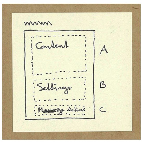
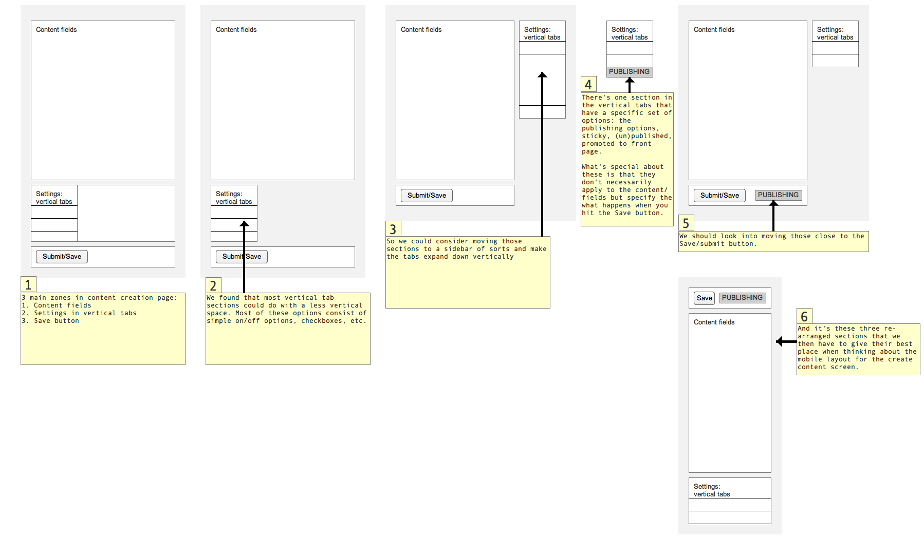
That input was then translated into very generic concept sketches, comparing and contrasting several arrangements of the three basic feature groups: content, settings and actions. From there, we proposed to pursue one specific direction in more detail. Before we did that, we opened up the work so far for feedback: http://groups.drupal.org/node/214898
Design
Starting from that very rough initial layout we started exploring the details of that arrangement. Which items belong in which area and how would they behave? How would it work on small screens? Which items to call out, which ones to push back?

Then Jared Ponchot stepped in and pulled all that sketching together in high-definition mockups. And on these we iterated again a couple of times, detailing the arrangement of interface elements, the use of color and other ways to (de-)emphasise certain parts of the whole. A comparison with the then current state of the Seven admin theme identified how we would have to extend its visual language to accommodate this new design.
And that’s where we opened up for another round of feedback: http://groups.drupal.org/node/217434
Test
A working prototype of the design proposal was coded and made available on a test site. A usability test plan was drafted and several people used that script to test the prototype with people both new to and experienced with Drupal. One of the few times we actively pushed for community driven usability testing actually. Results from the testing were reported in the implementation issue and individual issues were opened for the necessary changes.
Usability test plan: http://groups.drupal.org/node/223959
Implementation
The prototype for testing was created in context of the implementation issue. We spent a lot of time translating the design proposal into actionable tasks.
The distinction between rough prototyping code and actual core worthy implementation was a bit unclear at first but we very quickly got to a usable demo. The overarching “meta” issue has over 300 comments. Which is usually a sign of a large undertaking that’s not sufficiently broken down in seperate actionable tasks. But, we got there in the end!
Implementation meta issue: https://drupal.org/node/1510532
Lessons (not? :-) learned
- Good: working with a small team. It allowed us to focus on what needed to be done and move relatively fast.
- Good: Publicly documenting the research and sketching phases was a lot of work but worth it. Pulling a finalised glossy photoshop design out of the hat would not have created the same engagement and constructive feedback
- Good: counter to the previous point but also a good thing was that the initial sketches and design mockups were shared only within the very small team of 3 to 5 people. This kept momentum up but more importantly allowed us to focus on the actual design work. A broader discussion would very likely have shifted towards discussing implementation challenges, which is not what you’re after when still exploring multiple options.
- Not so good: we prototyped only one working version quite late in the process. Only after a lot of time invested did we get to see and feel a somewhat working version. This narrowed our bandwidth for subsequent changes, which were relatively small tweaks, keeping the basic paradigm intact. We never really pitted two or more radically different approaches against each other. This was mostly a time and energy issue: we only had the bandwidth to work through one design direction.
- Not so good: Doing the design phases outside of the issue queue (where implementation happens). This was a necessary but difficult trade off. The issue queue doesn’t lend itself to explorative work with lots of ambiguity so the design work wasn’t tracked there. Many core developers did not closely follow the process as it happened on groups.drupal.org, so when we brought the design over to the issue queue with the proposal to go build this, much of the earlier discussion points got brought up again.
- Not so good: Not having a primary code architect as part of the team. We could have prevented at least some of the rehash in the issue queue if we had had a knowledgeable core developer on the design team. Having somebody who could answer to the technical implications of the design and help break down the work into manageable tasks the would probably have gotten us off to a better start with implementation.
A quick tally of the number of comments across the main discussion threads and issues for this project: more than 1200. And that doesn’t even include huge additions like the WYSIWYG editor and the improved previews. Not to say that this doesn’t happen in other initiatives, but you can see how demanding it is for anyone who wants to keep track, especially if you want to make sure that the big picture doesn’t get lost in the myriad of details.
How to get better, faster?
The nature of design changes like these is that they touch many aspects: backend & frontend, php & javascript, visual design & performance, accessibility & multilingual, etc. If we want to go faster we might want to consider replacing the research intensive work with building multiple (rougher) prototypes earlier and testing those for viability. That might lead us to a general direction and a plan for implementation faster. As for the actual core worthy implementation, we might win some time if we can provide a design spec together with an initial plan identifying the technical challenges and strategies to overcome those.
The amount of work will always be huge. I think the gains are in finding a better balance in:
- Feeling free to write quick throw-away code in the initial explorations so people can get a feel of what might work and we can test it.
- Reducing wasted efforts (in code and discussion) during implementation.
Understanding the distinction between these two, and being clear about when the first ends and the second begins will already be a big step forward.
Further discussion: Determine process for big UX changes
